Crypto Interactions
Project Story: Building the Cryptocurrency Dashboard for Friends This project started when a few friends who were actively investing in cryptocurrencies expressed the need for an easy-to-use tool to track prices and trends. They wanted a simple interface that pulled data in real-time, so they could focus on the metrics that mattered most to them. With this in mind, I set out to design a Cryptocurrency Dashboard that met their needs. Here’s a breakdown of how I built it:
Client:
Role:
Designer
Year:
2022
The Challenge
Process
Step-by-Step Process
Research & Planning:
I began by speaking with my friends to understand what data they found most useful (e.g., current price, market cap, volume) and how they preferred to see it.
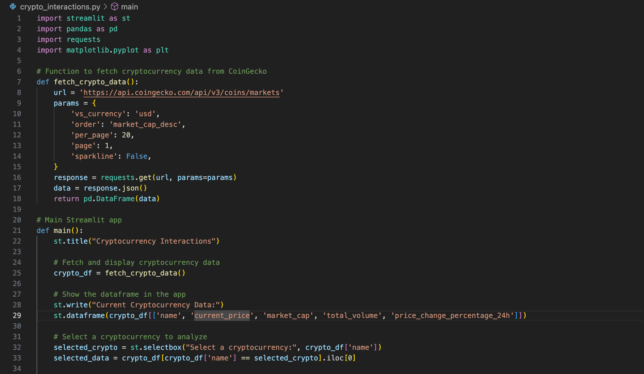
Next, I researched APIs and settled on the CoinGecko API because it offers comprehensive, real-time data on major cryptocurrencies.
Setting Up the Environment:
After deciding on Streamlit for the dashboard interface, I set up a local environment and installed the necessary libraries (e.g.,
pandas,requests,matplotlib).
API Integration:
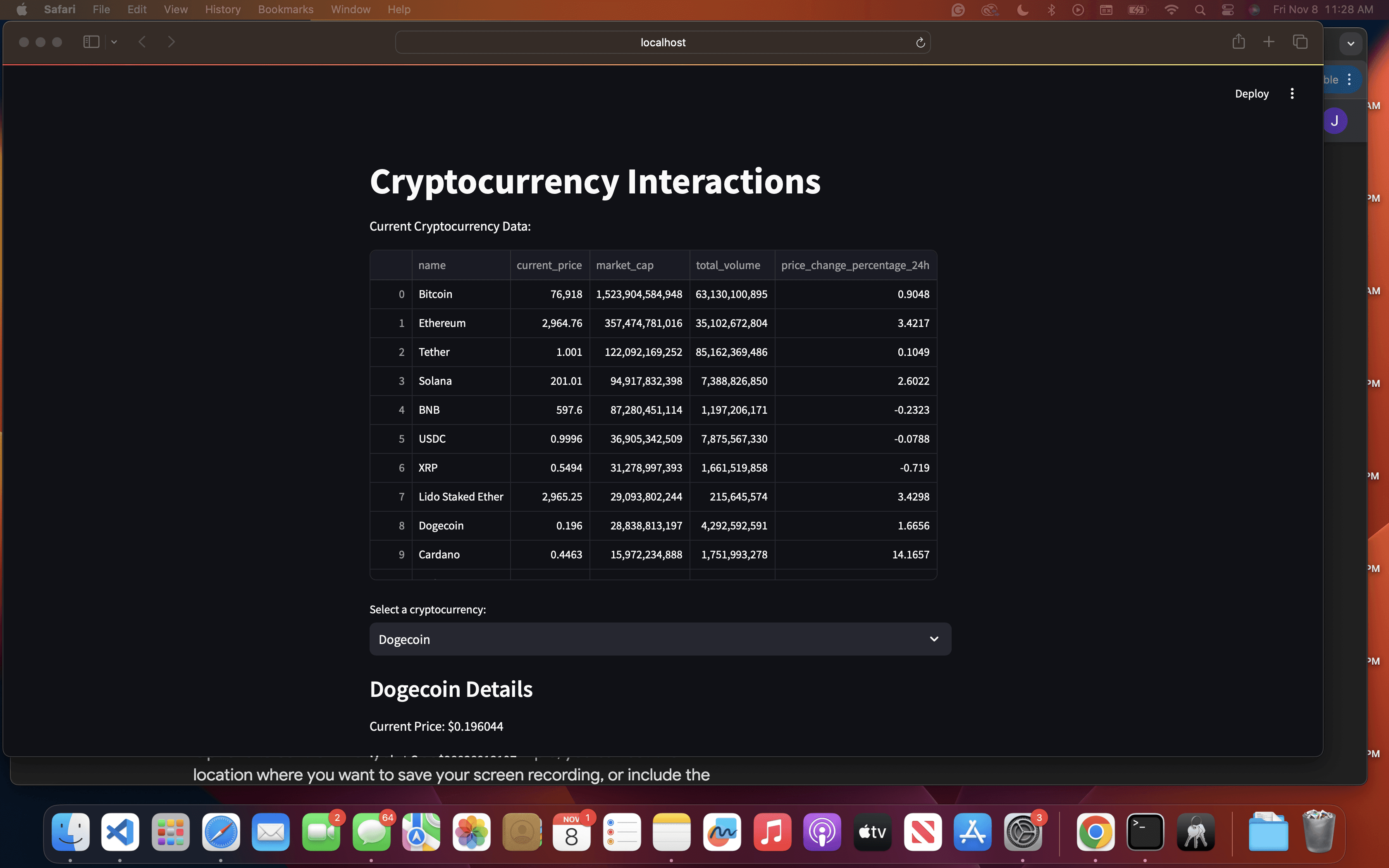
I built a function to fetch cryptocurrency data from CoinGecko’s API, applying filters for the top 20 cryptocurrencies by market cap.
This allowed me to structure the data in a clear and concise format with
pandasso that users could quickly view relevant metrics.
Designing the Interface:
I structured the dashboard to display essential data at a glance and included an interactive dropdown to select specific cryptocurrencies for more detailed information.
For each cryptocurrency, I created a section showing current price, market cap, total volume, and 24-hour price change.
Creating the Visualization:
To add a meaningful visual component, I simulated a 30-day price trend to illustrate how prices could fluctuate over time.
Using
matplotlib, I built a line graph that updates based on the user’s selection, making the data more engaging and informative.
Testing and Feedback:
After setting up the dashboard, I shared it with my friends for feedback. Their insights helped me improve the interface, including adding tooltips and refining the layout for clarity.
Solution
Source Code :
Key takeaways
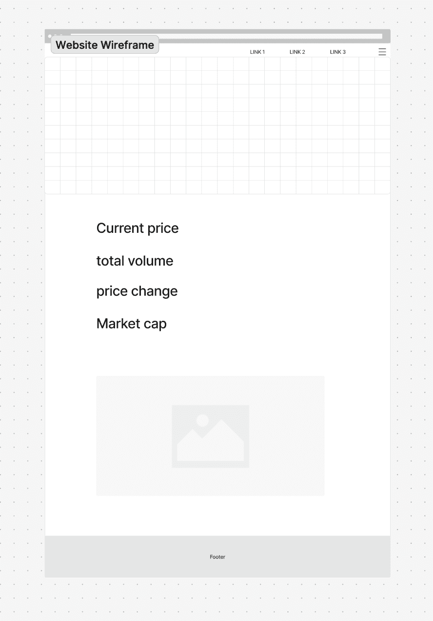
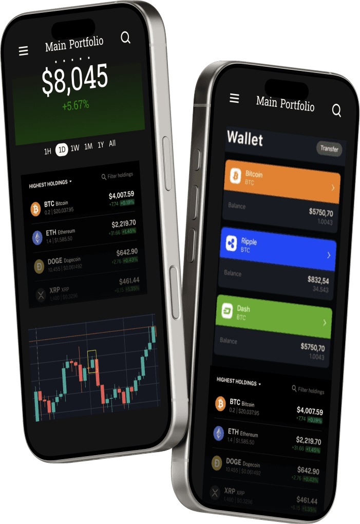
High Fidelity prototypes & wire frame